In “The World’s Worst PowerPoint Presentations” have several common characteristics:
- Overuse of Text: Many of the presentations contain large blocks of text on each slide, making it difficult for the audience to read and engage with the content.
- Poor Design Choices: These presentations often feature tacky and distracting design elements, such as garish colors, inconsistent fonts, and low-quality graphics.
- Lack of Clarity: The flow of information in these presentations is often confusing and lacks a clear structure. Flowcharts and diagrams are unintelligible, making it hard for the audience to understand the main points.
- Overcrowding: Some slides are overcrowded with too much information, making it overwhelming for the audience to process.
- Inconsistent Use of Colors: In some presentations, colors are used inconsistently, which can confuse the audience and make it challenging to differentiate between elements.
- Use of Transitions: Some presentations use unnecessary slide transitions that distract from the content rather than enhancing it.
- Ineffective Bullet Points: Instead of using bullet points to simplify information, these presentations sometimes misuse them by placing them in front of lengthy paragraphs, making the content harder to digest.
Missing Design Principles:
These presentations are missing several design principles and other principles like those from Mayer, Inclusive Design, and Universal Design for Learning (UDL)
- Mayer’s Principles (Coherence, Signaling, Cognitive Load Management)
- Inclusive Design (Accessibility)
- Universal Design for Learning (Flexibility for Diverse Needs)
WAVE Accessibility Checker
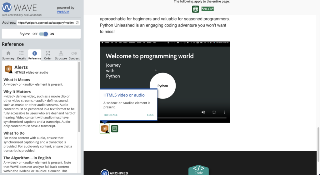
While reviewing the WAVE website, I noticed that my video in the blog section lacks a transcript. It’s crucial to provide a transcript to accommodate different viewers, especially in environments where sound may not be supported.
First off, you blog post is amazing. You really ripped into “The World’s Worst PowerPoint Presentations” and explained all your points thoroughly. I also like how you had the text side by side with you Canva poster, this was something i tried replicating on my own blog but couldn’t figure out. Your Canva poster is clear and concise and follows some of the things that were talked about in module 2. The only thing i would fix is the subtext under your Canva poster. Even though the subtext is a must have, i feel like you could of explained what the reader is looking at exactly.